


 |
 |
 |

To Top


I was recently contacted by Bundesliga Football (@BLFuk) who are launching a new website dedicated that corner of the globes footballing powerhouses. Anyway they were after a logo / brand and wanted to know if i could come up with something suitably ‘Germanic’
I knew the site would be based on the black, red and gold colours of the German flag, so thought what better muse than the German Eagle to accompany it. An authorative and imposing theme, I felt it would give just the right kind of vibe to a site in its infancy.
Obviously the current German badge has its own stylised eagle that has undergone a few design tweaks over the years, so i decided to go even further back in history till i reached German Heraldry, where i found an Aladins Cave of ideas.
The final design is meant to be nod to the past but with a fresh and modern feel, hopefully thats how it comes across. As always let me know your thoughts via the comments section below.
As a footnote to this piece I also wanted to include a version of the design that the client rejected. Personally I think I prefer the rejected version so thought I’d let people make their own minds up.
Available to buy as:
 |  |  |


I finally decided to take the plunge and attempt to sell a number of my illustrations via an Etsy store. Part of the setting up process invloved coming up with a unique store name together with an avatar / logo.
Having finally settled on the name Score Draws (do you see what i did there?) I began roughing out a few ideas for the logo. Hopefully the idea ive gone for is fairly straight forward. To calm my own fears I did a quick straw poll on Twitter and enough people seemed to recognise that the design invloved a pencil and a football, so i went with it as my final design.

This is something I’ve been interested in doing ever since I saw the new designs for our current badge. Whilst a lot of Boro fans have complained about the new badge there weren’t that many suggestions offered other than “put it back to the 86 version” or “lets return to the 3 ships and the shield”.
Anyway this is my first attempt but I hope it might evolve based on comments and feedback it receives. The general idea was to give little nods to different eras, so the lion is 70′s Maddren et al, with a Clough era square background, then horizontal bars underneath it in the style of our Heritage Hampers kit.
I wanted to keep things as simple as possible to start with, so be interesting to see what people think of it.
![]()
Someone has suggested it might help the process if I supplied the official badges ( past and present ) for comparison. So I have included a chronological list of the badges below, I have also included shirt and programme designs from those eras to help show what influenced my own design.
![]()
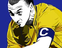
Zlatan Ibrahimovic illustration done as part of my ongoing A-Z project